
UX RESEARCH · CLIENT PROJECT
Role: UX Researcher & Designer
Tools: Figma
Focus: Usability testing, booking experience, information accessibility, brand identity
Deliverables: User research, usability findings, annotated screens, UX recommendations, UI redesign concepts
Mend
Designing an experience that goes beyond booking.
01. The Challenge
More Than Just a Booking App
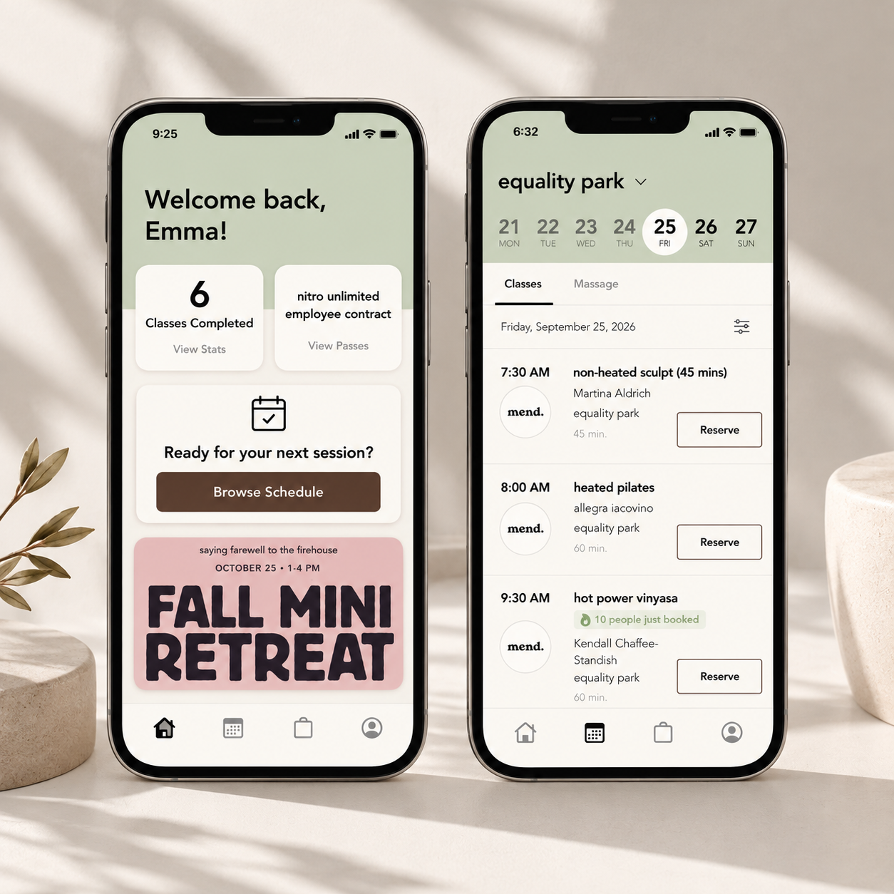
Mend’s app offers a straightforward booking experience but lacks the essential information and vibrant, inclusive personality that define the studio.
How might we improve usability, information accessibility, and brand identity without complicating the booking experience?
02. Project Overview
Understanding the User Experience
I collaborated with Mend Yoga Studio to evaluate its mobile app through 10 moderated usability tests with new and returning customers.
Research revealed opportunities to improve purchasing, make studio information more accessible, and bring Mend's personality into the app.
Goal: Create a more intuitive, informative, and engaging experience while preserving what already works.
Research & Discovery
Understanding How People Actually Use the App
To identify usability challenges, I conducted moderated usability testing with 10 participants, gathering feedback from users with varying levels of familiarity with Mend.
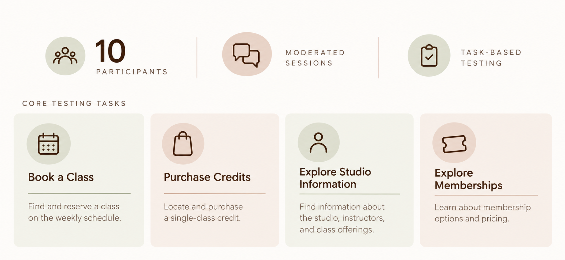
I observed navigation patterns, hesitation, misclicks, and backtracking, then gathered feedback about information clarity and Mend's brand experience.
Key Research Findings
Homepage: An Underutilized Opportunity
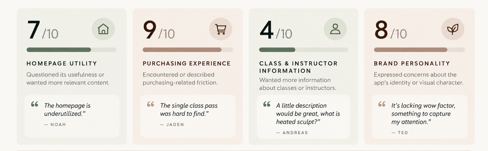
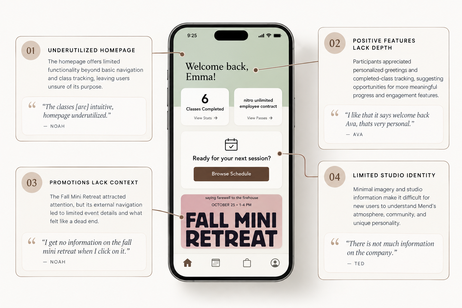
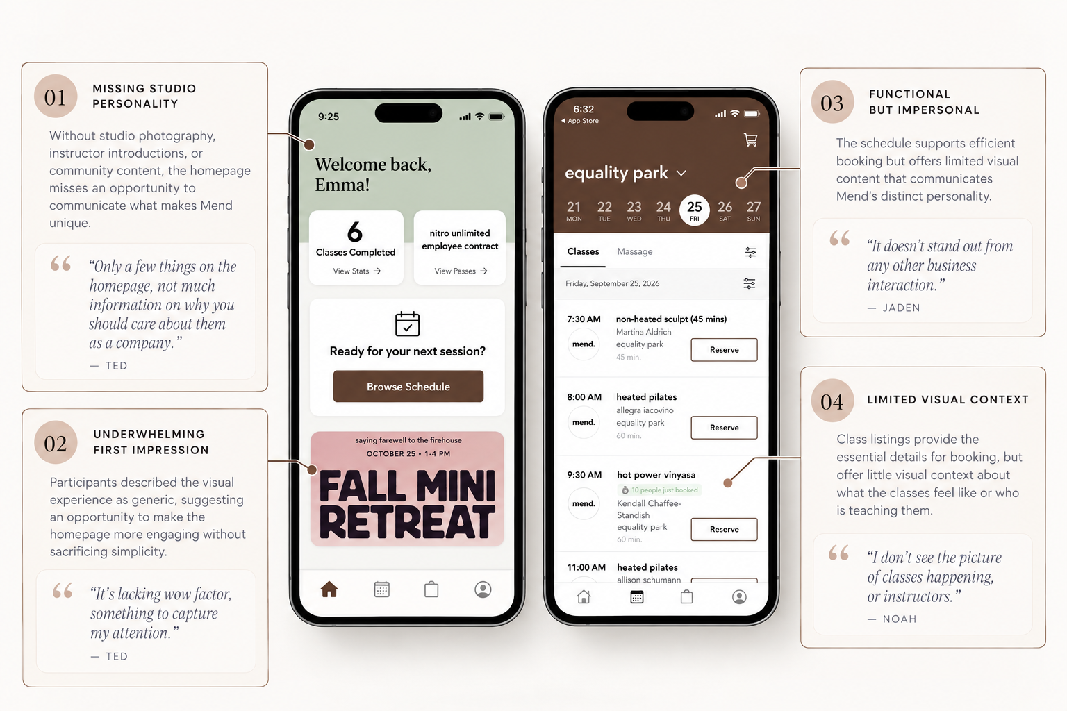
While participants appreciated the app's straightforward navigation and class-tracking features, usability testing revealed that the homepage lacked meaningful content, clear purchasing pathways, and a strong sense of Mend's identity.
New users especially struggled to understand what made Mend unique, while returning customers saw opportunities for easier access to classes and personalized progress.
Design opportunity: Transform the homepage into a more informative, engaging entry point that introduces Mend's community while supporting efficient class booking.
Memberships & Credits: Purchasing Clarity
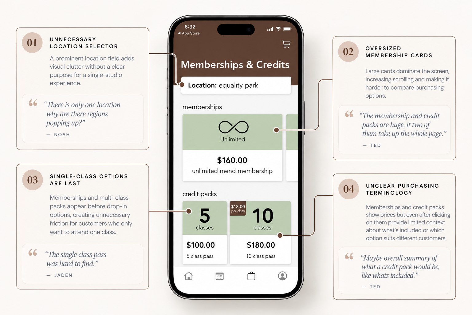
Usability testing revealed that while participants could generally navigate the purchasing experience, the page's hierarchy and limited descriptions made comparing options unnecessarily difficult.
Memberships and credit packs occupied much of the visible screen, while single-class options required additional scrolling. Participants also questioned purchasing terminology and the purpose of certain interface elements.
Design opportunity: Improve the visibility of drop-in classes, simplify the purchasing layout, and provide clearer descriptions to help users confidently choose the right option.
Class & Instructor Information
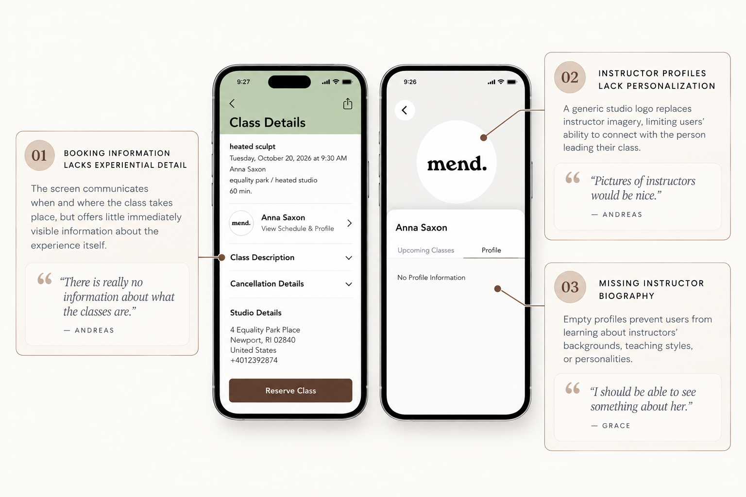
Testing revealed that while essential booking details were accessible, participants wanted more information about class formats and the instructors leading them. Missing instructor photos, biographies, and easily accessible class descriptions made it harder for new customers to understand what to expect.
Design opportunity: Enrich class and instructor profiles with meaningful descriptions, imagery, and personal details to help users make informed booking decisions and feel more confident attending their first class.
Brand Identity: A Functional App That Lacks Personality
While participants appreciated the app's straightforward navigation and scheduling experience, testing revealed a disconnect between its functionality and Mend's brand identity.
Several participants described the interface as generic or lacking personality, while new users struggled to understand the studio's atmosphere, community, and unique offerings. In contrast when users unfamiliar with mend were shown their social media they described the brand as “fun, chaotic, energetic and inclusive.” This highlights the gap between Mend brand and how they are displaying themselves within there app.
Design opportunity: Bring Mend's personality into the digital experience through meaningful imagery, instructor introductions, and engaging branded content, while preserving the simplicity returning customers appreciate.
What Was Already Working?
An important part of the research was identifying what didn't need to change.
Participants generally responded positively to the minimalistic interface, schedule, and calendar experience, describing it as intuitive and easy to navigate.
This reinforced the importance of preserving successful interactions while addressing specific points of friction.
From Research to Design
Following usability testing, I identified four priority areas for improvement. The next phase involves collaborating with Mend to implement targeted changes that address user needs while preserving the app's existing functionality.
01 — Information Accessibility
Improve studio, instructor, class, and membership information.
02 — Navigation & Purchasing
Make purchasing credits and exploring membership options more intuitive.
03 — Homepage & Brand Experience
Bring more of Mend's personality and useful content into the app.
04 — Booking Feedback
Improve reservation clarity, cart visibility, and booking confirmation.
What's Next?-Work in Progress
I'm currently coordinating with Mend to determine which improvements can be implemented. Once changes are made, I plan to conduct another round of usability testing to evaluate their effectiveness.